02. 使用Vue3集成Element-Plus快速搭建一个管理系统的页面框架
Elemen-Plus 简介
Element-Plus 是一套前端 UI 框架,非常适合前端基础比较差的同学,可以通过它快速实现精美的页面样式
国内镜像网站(访问速度快):https://cn.element-plus.org/
Vue3 集成 Element-Plus
安装依赖
npm i element-plus -S
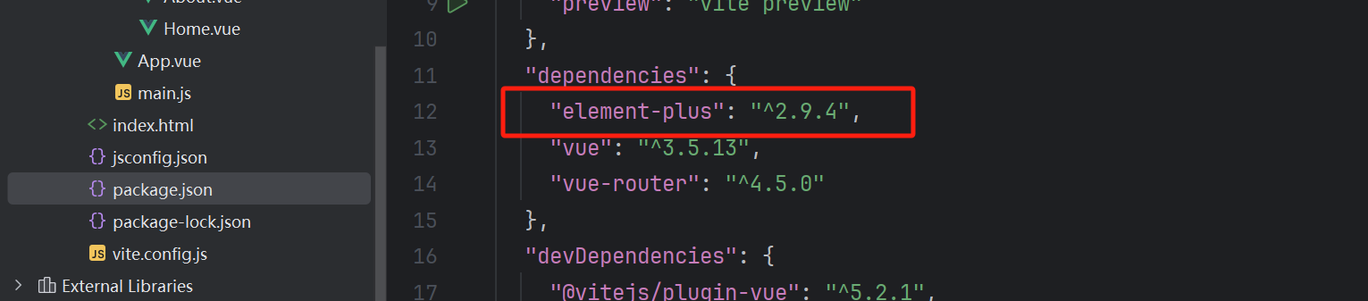
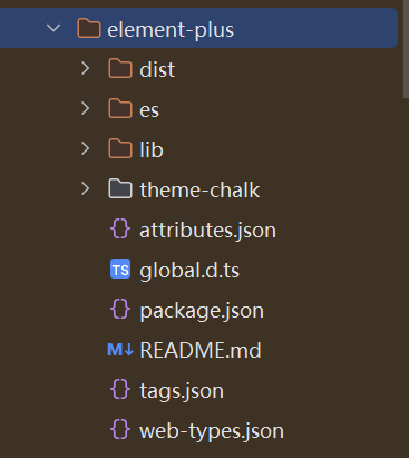
node_modules
卸载 element-plus
npm uninstall element-plus
在 main.js 里面引入
import ElementPlus from 'element-plus'
import 'element-plus/dist/index.css'
import zhCn from 'element-plus/es/locale/lang/zh-cn'

app.use(ElementPlus, {
  locale: zhCn,
})
测试使用 Element-plus 组件
使用官方的 按钮组件
<el-button>Default</el-button>
<el-button type="primary">青哥哥</el-button>
<el-button type="success">小武哥哥</el-button>
<el-button type="info">Info</el-button>
<el-button type="warning">Warning</el-button>
<el-button type="danger">Danger</el-button>
Home.vue 测试内容
<template>
  <div>
    <el-button>Default</el-button>
    <el-button type="primary">青哥哥</el-button>
    <el-button type="primary">青哥哥</el-button>
    <el-button type="primary">青哥哥</el-button>
    <el-button type="primary">青哥哥</el-button>
    <el-button type="success">小武哥哥</el-button>
    <el-button type="info">Info</el-button>
    <el-button type="info">Info</el-button>
    <el-button type="info">Info</el-button>
    <el-button type="info">Info</el-button>
    <el-button type="warning">Warning</el-button>
    <el-button type="danger">Danger</el-button>


    <div style="padding: 50px">
      <el-icon size="25" color="green"><ChatDotRound /></el-icon>
      <el-button type="primary" icon="Search">按钮</el-button>

      <el-input placeholder="placeholder" :suffix-icon="Calendar" :prefix-icon="Search"></el-input>


    </div>
  </div>
</template>

<script setup>
import {Calendar, Search} from "@element-plus/icons-vue";
</script>
全局使用 icon
安装依赖,注册所有图标
npm install @element-plus/icons-vue
在 main.js 里引入
import * as ElementPlusIconsVue from '@element-plus/icons-vue'

for (const [key, component] of Object.entries(ElementPlusIconsVue)) {
  app.component(key, component)
}
使用图标:el-icon、el-input、el-button
el-input:当你在输入框组件里面使用图标,你需要单独导入图标
el-icon、el-button:按钮或者图标组件里面,不需要单独导入图标
Element-Plus 主题色设置
安装依赖 sass、unplugin-vue-components、unplugin-auto-import
npm install -D sass unplugin-vue-components unplugin-auto-import
配置 index.scss 放在 src/assets/css 目录下
@forward "element-plus/theme-chalk/src/common/var.scss" with (
  $colors: (
    "primary": ("base": #2c82ff),
    "success": ("base": #31bf00),
    "warning": ("base": #ffad00),
    "danger": ("base": #e52f2f),
    "info": ("base": #8055ff),
  )
);
配置 vite.config.js
import AutoImport from 'unplugin-auto-import/vite' // 自动导入vue中的组件
import Components from 'unplugin-vue-components/vite' //自动导入ui-组件 比如 element-plus等
import { ElementPlusResolver } from 'unplugin-vue-components/resolvers' // 对应组件库引入 ,AntDesignVueResolver

plugins: [
  vue(),
 //element-plus按需导入
  AutoImport({
    resolvers: [ElementPlusResolver()],
  }),
  Components({
    resolvers: [
      // 配置elementPlus采用sass样式配置系统
      ElementPlusResolver({importStyle:"sass"})
    ],
  }),
],
css: {
  preprocessorOptions: {
    scss: {
      additionalData: `@use "@/assets/css/index.scss" as *;`,
    },
  },
},
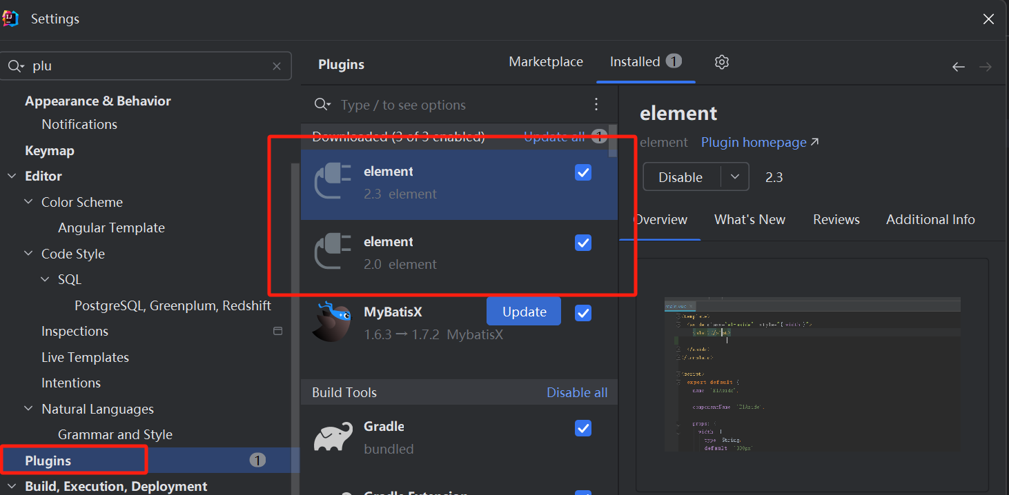
安装 element 插件
搭建后台基本框架
框架布局分析
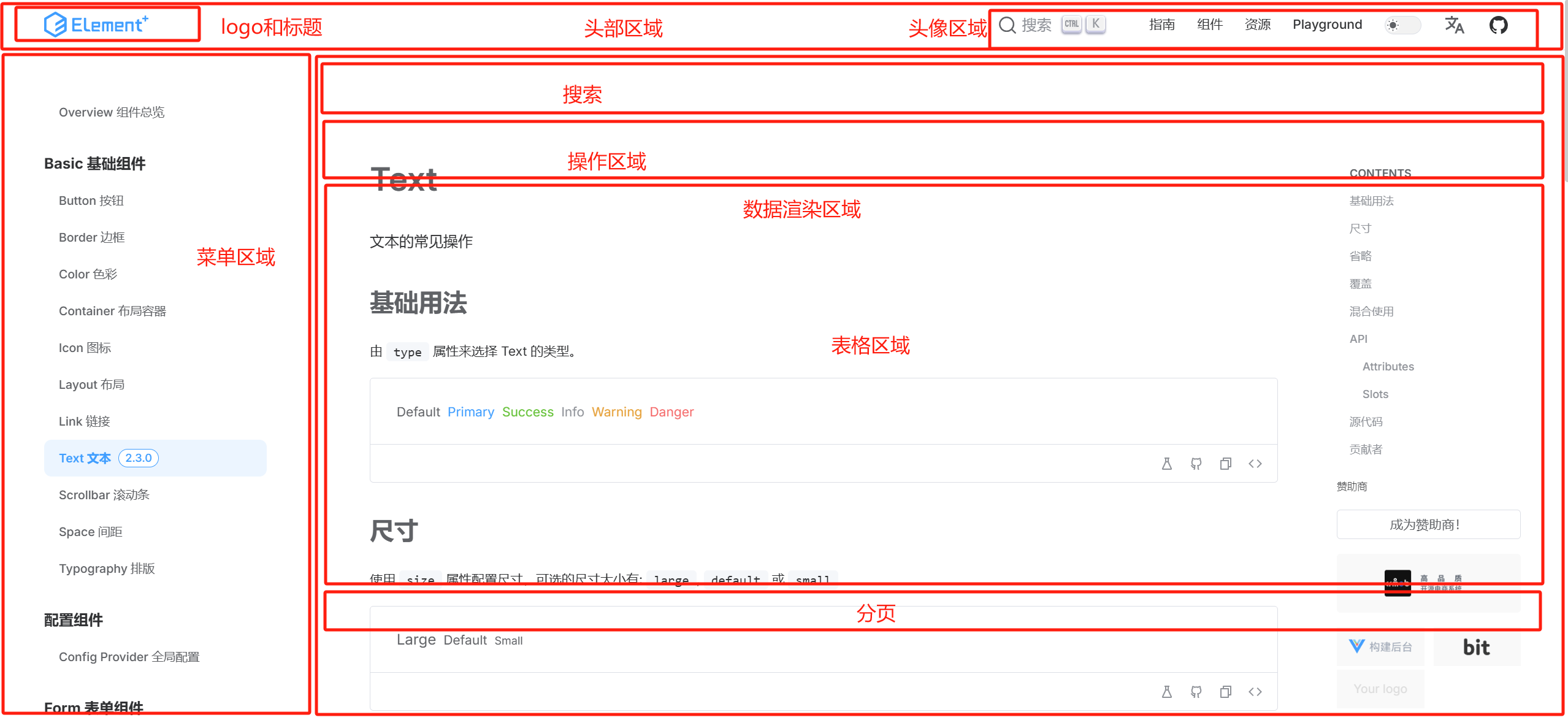
配置头部区域

配置导航菜单
菜单主体颜色:#3a456b
高亮颜色:#537bee
点击 menu 里面的某一项 跳转页面怎么做?
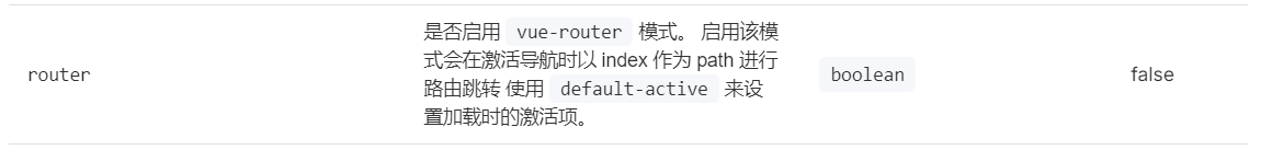
高亮显示当前展示的路由
可以通过 router.currentRoute.value.path 获取当前展示的路由
:default-active="router.currentRoute.value.path"
图片取色器
https://www.jyshare.com/front-end/6214/#65ae8f
#e6ecf7
主体区域
配置一个 card 卡片样式

.card {
    background-color: white;
    padding: 10px;
    border-radius: 5px;
    box-shadow: 0 0 8px rgba(0, 0, 0, .12);
}
本节课笔记内容
Manager.vue
<template>
  <div>
    <!-- 头部区域开始 -->
    <div style="height: 60px; display: flex;">
      <div style="width: 240px; display: flex; align-items: center; padding-left: 20px; background-color: #3a456b">
        <img style="width: 40px; height: 40px; border-radius: 50%" src="@/assets/imgs/logo.png" alt="">
        <span style="font-size: 20px; font-weight: bold; color: #f1f1f1; margin-left: 5px">小白做毕设2025</span>
      </div>
      <div style="flex: 1; display: flex; align-items: center; padding-left: 20px; border-bottom: 1px solid #ddd">
        首页 / 数据分析
      </div>
      <div style="width: fit-content; padding-right: 20px; display: flex; align-items: center; border-bottom: 1px solid #ddd">
        <el-dropdown>
          <div style="display: flex; align-items: center">
            <img style="width: 40px; height: 40px; border-radius: 50%" src="https://cube.elemecdn.com/3/7c/3ea6beec64369c2642b92c6726f1epng.png" alt="">
            <span style="margin-left: 5px">管理员</span>
          </div>
          <template #dropdown>
            <el-dropdown-menu>
              <el-dropdown-item>个人信息</el-dropdown-item>
              <el-dropdown-item>修改密码</el-dropdown-item>
              <el-dropdown-item>退出登录</el-dropdown-item>
            </el-dropdown-menu>
          </template>
        </el-dropdown>
      </div>
    </div>
    <!--  头部区域结束 -->

    <!--  下方区域开始 -->
    <div style="display: flex">
      <!--  菜单区域开始 -->
      <div style="width: 240px;">
        <el-menu router :default-openeds="['1']" :default-active="router.currentRoute.value.path" style="min-height: calc(100vh - 60px)">
          <el-menu-item index="/manager/home">
            <el-icon><House /></el-icon>
            <span>首页</span>
          </el-menu-item>
          <el-sub-menu index="1">
            <template #title>
              <el-icon><location /></el-icon>
              <span>数据管理</span>
            </template>
            <el-menu-item index="/manager/about">关于数据</el-menu-item>
          </el-sub-menu>
        </el-menu>
      </div>
      <!--  菜单区域结束 -->

      <!--  数据渲染区域开始 -->
      <div style="flex: 1; width: 0; padding: 10px; background-color: #f2f4ff">
        <RouterView />
      </div>
      <!--  数据渲染区域结束 -->

    </div>
    <!--  下方区域结束 -->

  </div>
</template>

<script setup>

import router from "@/router/index.js";
</script>

<style>
.el-menu {
  background-color: #3a456b;
  border: none;
}
.el-sub-menu__title {
  background-color: #3a456b;
  color: #ddd;
}
.el-menu-item {
  height: 50px;
  color: #ddd;
}
.el-menu .is-active {
  background-color: #537bee;
  color: #fff;
}
.el-sub-menu__title:hover {
  background-color: #3a456b;
}
.el-menu-item:not(.is-active):hover {
  background-color: #7a9fff;
  color: #333;
}
.el-dropdown {
  cursor: pointer;
}
.el-tooltip__trigger {
  outline: none;
}
.el-menu--inline .el-menu-item {
  padding-left: 48px !important;
}
</style>
Home.vue
<template>
  <div>
    <div class="card" style="margin-bottom: 5px">
      <el-input style="width: 260px; margin-right: 5px" v-model="data.name" placeholder="请输入名称查询" :prefix-icon="Search"></el-input>
      <el-button type="primary">查 询</el-button>
    </div>
    <div class="card" style="margin-bottom: 5px">
      <el-button type="danger">批量删除</el-button>
      <el-button type="primary">新 增</el-button>
      <el-button type="success">批量导入</el-button>
      <el-button type="info">批量导出</el-button>
    </div>

    <div class="card" style="margin-bottom: 5px">
      <el-table :data="data.tableData" style="width: 100%" :header-cell-style="{ color: '#333', backgroundColor: '#eaf4ff' }">
        <el-table-column type="selection" width="55" />
        <el-table-column prop="name" label="名称" width="180" />
        <el-table-column prop="phone" label="电话" />
        <el-table-column prop="address" label="地址" width="180" />
      </el-table>
    </div>
    <div class="card">
      <el-pagination
          v-model:current-page="data.pageNum"
          :page-size="data.pageSize"
          layout="total, prev, pager, next"
          :total="data.total"
      />
    </div>
  </div>
</template>

<script setup>
import { reactive } from "vue";
import {Search} from "@element-plus/icons-vue";

const data = reactive({
  name: null,
  pageNum: 1,
  pageSize: 5,
  total: 6,
  tableData: [
    { name: '青哥哥', phone: '13877886677', address: '北京市朝阳区' },
    { name: '小武哥哥', phone: '13988997788', address: '上海市徐汇区' },
    { name: '小张', phone: '138776554466', address: '安徽省合肥市' },
    { name: '小李', phone: '138799882566', address: '安徽省合肥市' },
    { name: '小王', phone: '13987622566', address: '安徽省合肥市' },
    { name: '小周', phone: '13487772266', address: '安徽省合肥市' },
  ]
})
</script>
global.css
:root {
    --el-color-primary: green;
}

* {
    box-sizing: border-box;
}

body {
    margin: 0;
    padding: 0;
    color: #333;
    font-size: 14px;
}

a {
    text-decoration: none;
}

.card {
    background-color: white;
    padding: 10px;
    border-radius: 5px;
    box-shadow: 0 0 8px rgba(0, 0, 0, .12);
}